info
Description
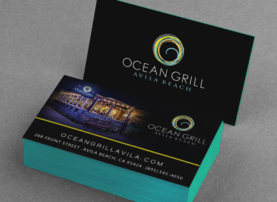
Business Card Design created for restaurant
What Should Be on Your Card and How to Make It Stand Out
What goes on your business card largely depends on what kind of business you’re in—or want to be in—and whether or not you have the ability to make your own. If you work for a large company your card might be predetermined, but that doesn’t mean you can’t use something of your own design. Either way, there are a few essentials you should include.
Be deliberate about the information you include and keep clutter to a minimum. You don’t want the most important bits of information getting lost in a mess of words and numbers. You need your name—or name you go by—and job title on the card, along with the name of your company or what you do. List your business phone number, work email, web site, and possibly the location of your business if that’s important to know.
Put your information on the front and leave the back blank. If you’re adventurous you can experiment with different styles or maybe a logo on the back, but for a solid card style you can rely on keeping things basic.Writer John Williams at Entrepreneur recommends keeping the back of your card blank:
How often will people see the back of your business card? Traditional card storage modes assume that side is blank. If you do wish to put copy on it, be sure the information is of a supplemental nature: e.g., your company’s mission or tagline. While business cards should promote your brand identity, they shouldn’t be confused with advertising.
Use white as the base color of your card. That way, people who have received your card can write visible notes or additional info on the front and back.
Stick to the standard size of 2″ by 3.5″. It may seem like an easy way to make your card stand out from the crowd, but more than likely you’ll get your card tossed because it won’t fit in someone’s wallet or other business card holder. Remember, the idea of the business card is give them reference information after you’ve wow’d them or pique their curiosity so that you can wow them later on. You don’t necessarily need to wow them with bizarre card shapes or confusing designs.
Use your photo and add value to your card. Susan Adams at Forbes spoke with online marketing consultant Don Crowther, and he suggests putting your gorgeous mug on your card:
Why include a picture? “You go to a convention, and you come home with 55 cards in your pocket,” Crowther says. If one or two cards have photos, you’ll remember those people.
Crowther also suggests that including some sort of incentive on your card will increase the likelihood of others getting in touch with you. You can offer discounts, special services, or even advice if that fits your business. You want people to remember you and feel like getting in touch with you will benefit them.
On the U.S. Small Business Administration blog, writer and CEO of GrowBiz Media Rieva Lesonsky shares some other tips on standing out worth considering:
- Incorporate QR codes: The jury is still out on this, but for some professions—like tech related careers—QR codes can be a great way to direct people to a web page filled with important information that could never make it on a card. It also, however, takes up a great deal of space, so don’t let it become clutter.
- Spend more on quality: You can buy basic business cards for very cheap, but you may want to consider the message you’re sending with cheap paper and print jobs. Think of how a nice magazine feels in your hands compared to a floppy tabloid. Regardless of what’s inside, the magazine feels better and seems more professional.
- Choose the right font: Keep your fonts 12 points or larger and make sure they are legible! It’s okay to play around a little here, but if you’re even a little bit concerned if others will be able to read your card, pick something else.
- Consider professional help: One way to ensure you get what you need is by hiring someone whose job is to design. Graphic designers know their craft and they can come up with something clever, informing, and professional.
All in all, there are three keys to a perfect business card: it contains all vital information needed to contact you, it entices people to learn more about you or get in touch, and it stands out without being too different.
Infomation
- : Ocean Grill
- : Avila Beach, CA
- : Business Card Blue, Restaurant
