info
Description
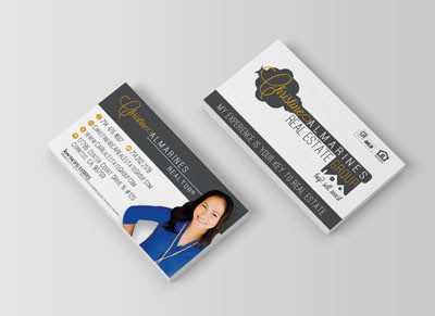
Business card design created for real estate at Vibrant Branding agency.
10 Business Card Mistakes You Might be Making
To write this post, I grabbed ten random business cards from a stack I received last week. So you can see I didn’t have to look far for examples.
So if you are ready, pull out your business card, lay it on the desk near your computer, pull out a pen or highlighter and be ready to identify the mistakes you are making
Here are the 10 business card mistakes people make:
1. Small font size. Some of us have perfect vision. But if that’s what it takes to read the letters and numbers on your card, you are asking for trouble. Because most of us don’t. So today (or before you print your new cards), please walk them around to a variety of people and ask a simple question: “Can you tell me what this says?”
2. Glossy paper. One way I can make your card more usable and memorable is to make some notes on it before I leave you. But if you have a varnish on top, you make that hard. Will your cards get a little dirty without it? Yes. But I’d rather be able to write on your card. And ask you to keep your cards out of your wallet.
3. Light font color. I mentioned font size up above. This one’s about font color. It’s also about contrast. So if your card uses a font that is too light (grey, for example) or one that is too close to the color of your card, I won’t be able to read it. And if I can’t read it, there’s a good chance I will send an email to the wrong address or call the wrong phone number. Or just give up.
4. Design inconsistent with website. Whether your business is just you or you + 100 others, there is great value in having a card design that integrates the look and feel of your brand. So if you have a website, a store front, a product line look or anything else, shouldn’t the look of your business card be consistent? Few of us have enough money to be driving thousands of people to our site or store everyday. But you can at least create more recognition of your brand via integration of your marketing materials.
5. No links to social media sites. If you use Facebook, Twitter or YouTube to attract people to your brand, shouldn’t you include links to those sites on your business card? It’s a great way to encourage more fans and followers. Simply by letting people know how to find you. Can’t find the space? See #10 below.
6. No email/web address or bad email. Amazingly, I found two cards without an email address. And one without a web address. Just a phone number. What if I’m not ready to talk live yet? There’s always a place to send people. Don’t have a website? Use your LinkedIn profile. And then there were two cards that had a nice logo and business name combined with a gmail address. That lowers your credibility in my eyes. Especially when it is so easy to get an email address with your own custom url.
7. Printed on poor quality paper. I have a friend who owns a consulting business who charges in the five figures for their services. When I got their new business card recently, I was disappointed to pick it up and realize (instantly) what cheap paper they used. Please don’t “cheap out” on the paper. Your brand matters to people. And often the first and early impressions are based on things like your business card. Would I pay $10,000 to someone who has a paper-thin business card? Would you?
8. Shares too much information. Some cards are so full of information that you really don’t know where to start. A business card is not a good place for your elevator pitch. It’s a place to entice people. To draw them in and guide them as to how they can learn more about your business or services. Are you over-delivering on your card?
9. Includes no brand promise or tagline. Every person, company, organization or nonprofit needs a clear and compelling brand promise. Without a brand promise, your card is simply a contact card – a lot less interesting.
10. Does not use back of card. I believe in white space (room around the content that makes your card easier to read) so I always recommend you use the back side of the card. If you put your brand promise on the back, you can hand someone your card with that side facing up (and saying the brand promise out loud).
Infomation
- : Vibrant Branding
- : Pismo Beach, CA
- : Business Card Colorful, Real Estate
